
 Watch
Watch Another member of the noiseless charts family is Points & Figure charts. Like Renko charts, they are one or unidimensional charts as they plot the movement of the prices of either stocks, futures or commodities without considering the parameter of time.

Other technical charts, for example, candlesticks, plot price movements of securities during a set period of time. Point & Figure charts in technical analysis, however, are based on the principle of plotting the prices in columns consisting of Xs and Os stacked together, each representing a fixed amount by which the price has moved.
You must note:
- Rising prices are reflected by the Xs
- Os represent the decline in price
Some technical analysts believe the Point & Figure charts have been designed for long-term investment and are one of the simplest ways of ascertaining strong entry and exit points for securities trade. These charts provide insights into developing trends while monitoring the supply and demand of each individual issue.
How to create a Point & Figure Chart
Unlike the traditional charts that make use of open-high-low-close price movements over a period of time, Point & Figure analysis lays emphasis only on the closing price of the underlying asset.
There are three main constituents of a Point & Figure analysis in stock market:
Box size: As highlighted, price movements on these charts are captured by rising columns of Xs and falling columns of Os, with each column capturing the uptrend or a downtrend. Each X or O is set in a box on the chart and the size of this box is defined by the price range set by the trader/chartist.
The trader can set the box size based on a percentage like 2, 3 or 5 percent of the prevailing price. If the size is set at 5 percent and the prevailing price is Rs 100, the box size will be set at Rs 5. The box size can also be set based on the daily average true range (ATR) such that the size of the box will fluctuate according to the prevailing volatility. As a default, the range is set at 20 days. Alternatively, the trader can set his own box size, but it may be noted that a large box size will depict fewer reversals but more movements in price. Conversely, a small box will depict more reversals and lesser price movements.
Reversal parameter: This is usually set at three times the box size, but the trader can set it at any amount as per his will, such as 2, 4, 5.5, etc. So, if the box size is Re 1 and the reversal parameter is set at 5 times, then the reversal amount will be Rs 5.
Price data: Either the closing or the high and low prices can be used here. If a trader considers the closing price, then there will be lesser Xs and Os, but the use of high and low prices will create a higher number.
Consider this - a stock is trading at Rs 100, box size is at Re 1 and a reversal box is three units. Now, if the stock has been trading at a price greater than Rs 100, the stock would have to close at Rs 97 before the chart would reverse to a column of Os.
Since the principle of Point & Factor charts requires that each price movement has to be plotted, each decline in price from Rs 100 must be represented by an O in the new downward column of Os. On the other hand, any reversal in stock price would need the stock trading higher by Rs 3 after which a new column of Xs will appear on the chart.
Assuming the stock falls to Rs 90 before it reverses its trend upwards, a new column of Xs will emerge once the stock price hits Rs 93, since the reversal unit is set at Rs 3.
How to read a Point & Figure chart
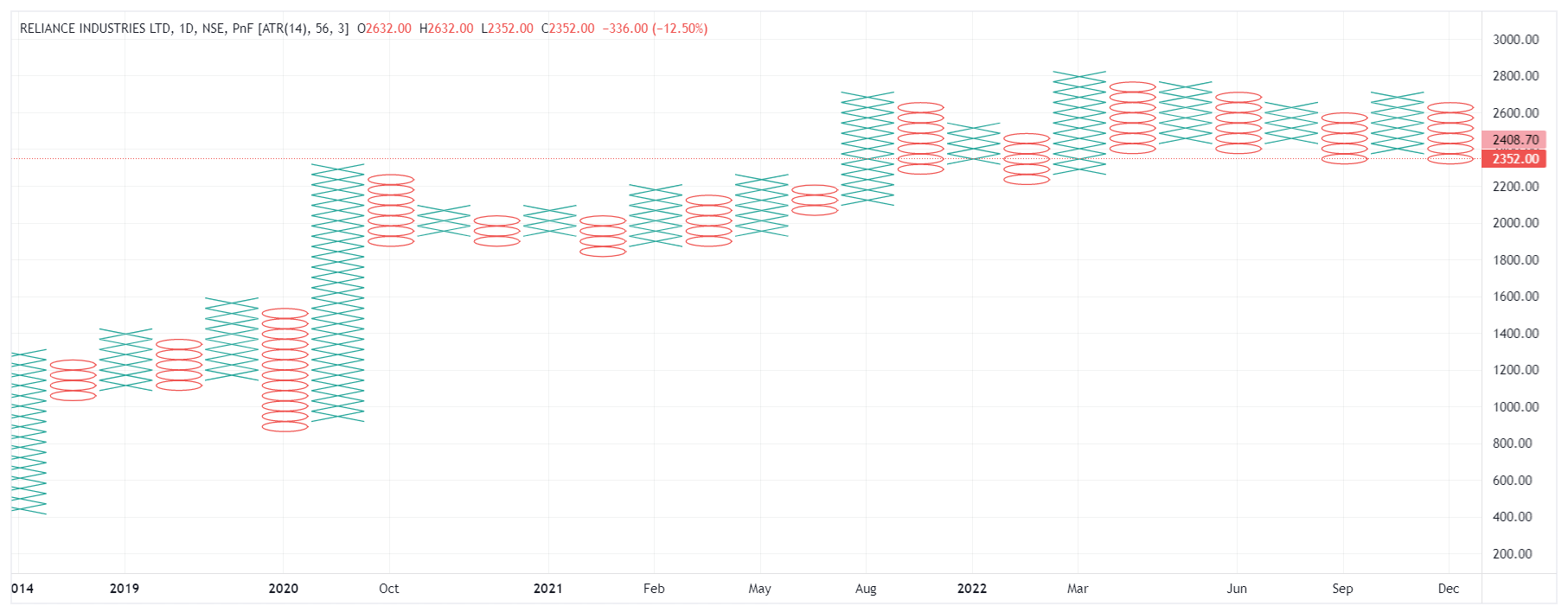
These charts are quite effective in depicting the support and resistance levels as well as the upward and downward trendlines. Support levels can be gauged by drawing a horizontal line at the low of a series of O’s columns with equal lows, while resistance levels can be ascertained by drawing a horizontal line at the high of a series of X’s columns with equal highs.
Point & Figure charts also help identify bullish and bearish patterns such as double top/bottom breakout, triple top/bottom breakout and quadruple top/bottom breakouts.
An important point to note here is that in the case of these charts, double top breakouts are considered bullish, whereas, in the case of bar charts, it is the reverse as the double top breakouts are considered bearish.
Benefits of using Point & Figure charts
- These unidimensional charts focus only on the price movements and do not include the impact of time.
- They help filter out unwanted noise from the charts.
- The columnar format makes it easier to point out the support and resistance levels as well as the trends.
- These charts are a proven tool for analysing price movements.
- They help traders ride any strong trend for longer as they filter out a lot of small price aberrations from the underlying trend.
Limitations of using Point & Figure charts
- These charts are slow to react to price movements, as the price must move by the box size set by the trader.
- This may result in the movement of price beyond the breakout point, and the trader may miss the entry/exit at the correct time.
- Traders are advised not to solely depend on these charts as they won’t be able to identify the reversal till the time price has moved significantly against their strategy, and this may result in profit erosion or losses.
- While using these charts, it is also advised to keep track of the actual price of the security with the help of candlesticks or other options so that the risk can be kept under control.
- Short-term or day traders should avoid using these charts as they are majorly used for identifying long-term trends which take a long time to reverse.
Points to remember
- Points & Figure charts are unidimensional charts.
- They plot the movement of the prices without considering the parameter of time.
- These charts are slow to react to price movements, as the price must move by the box size set by the trader.
- These charts are mainly used for identifying long-term trends which take a long time to reverse.
 0
|
0
|
 0
0

